
Website Design for Chicken Stop, a restaurant out of the city of New York, a source of high quality grilled chicken.
Product Designer.
UI Design
UX Research
Wireframing
Mockup
Figma
Adobe Photoshop
Adobe Illustrator
December 2021 -
January 2022
In 2021, Chicken Stop had realized the need to go online. They were about to start a new business offering the best grilled chicken out of New York. However, there was one problem, people preferred to stay indoors because of the pandemic. That meant they had to receive more phone calls and dictate the menu over the phone.
With a website, the challenges of the business could be all solved in one swift move. The customers will be able to access menu via a website as well as place orders while sitting at home and anticipating delivery. This will lead to a happy customer base and a fulfilled business. I had worked on their brand identity and I was contacted again to work on the UX and UI of the website and I accepted.
.png)
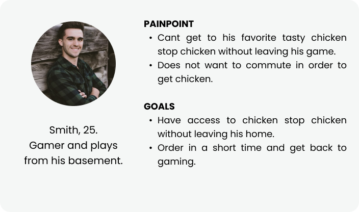
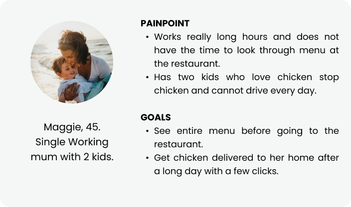
The Users of the website are residents in the city of New York who patronize the business. These users range in age from 17 – 50.
I was responsible for the UX research as well as the design of the product - low fidelity prototype, high fidelity prototype and passing it on to the developer for development.
The tools for this project is Figma, Adobe Illustrator and Adobe Photoshop.
.png)
To gain a better understanding of the problem and especially because I was not physically present, a lot of information was provided by the client to understand the audience and from which user personas were created.
Understanding the needs of the users meant there was one simple answer. A new website. I also did further research looking at competitor websites from yelp. At the end of the day, the aim of the new website was to:
1. Lead to the order portal for Chicken Stop.
2. Provide the Chicken Stop menu after a single click.
The client also informed me of an ordering portal they were linked to and as such I did not have to design the order pages but the new website will link to it. I however ensured that the said order page stayed consistent with our brand tone using tools such as color, logo and imagery.
The purpose of the website was straightforward. The goal was to reach the user’s aim with a few easy clicks. The user flow was thus designed as:

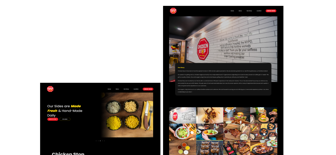
I started from a hand sketched prototype on a paper to explore different iterations. This led to the digital low fidelity wireframe. After completing the low fidelity, I proceeded to the high fidelity prototype offering a light mode and a dark mode.
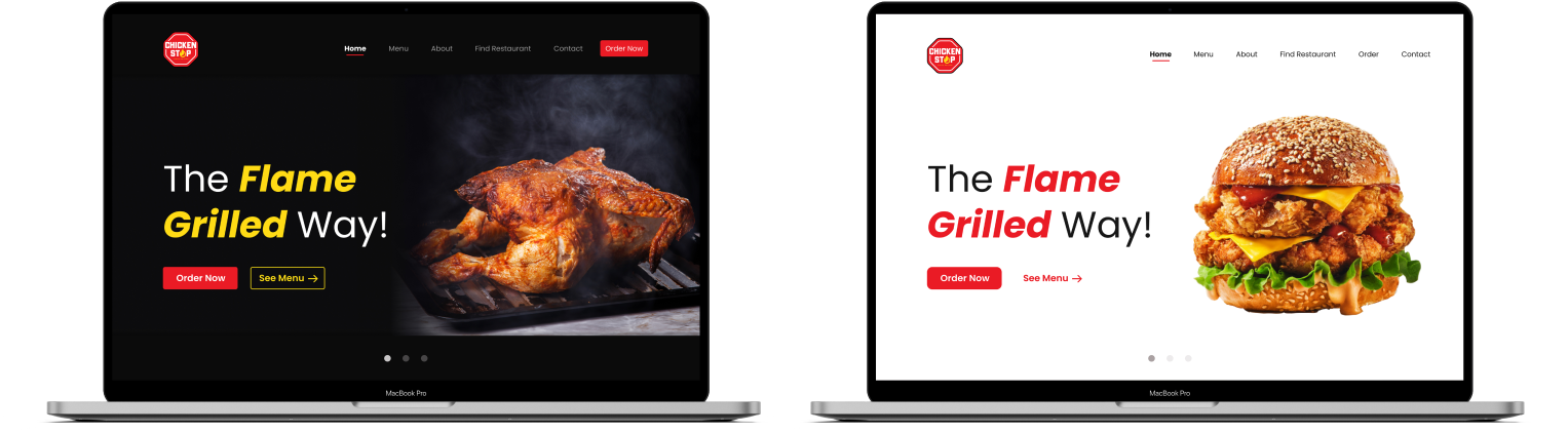
The website was tested on both light mode and dark mode and we opted to go with the dark mode to stick to the brand tone as well as be distinct from the client’s competition. As a result of the feedback on the test too, a few changes were made on the final product
1. I was limited in my research because I was not physically present in New York at the time. I however subsequently learnt that I could have employed other means to get directly to the customers for a more informed research.
2. UX design is reliant on a lot of communication and constant communication with the client and developer needed to be improved for the project to be successful.

